So after the floors were done, my father-in-law came to our house for a week and worked with my husband on bringing the kitchen to a usable point of existence. This meant installing the sink, faucet, and plumbing, getting in all the cabinets, and installing doors and drawers. This also meant building a fridge enclosure, as well as my father-in-law, who is a carpenter, cutting all of our butcher block countertops for us so that we could stain, seal, and install them later. They got all that work done in great time and did a brilliant job. If you know them and see them at any point, give them a few congratulatory butt slaps for a job well done.
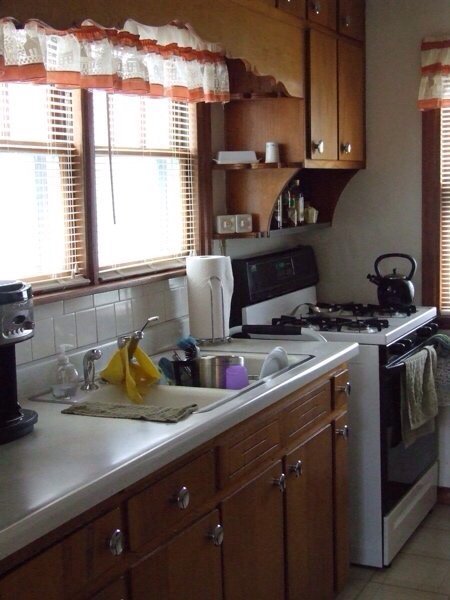
Because I like high drama kitchen reveals, here's a reminder of what it looked like when we moved in during March of 2008:
The dusty ruffled valances and mini blinds really sealed the whole home purchase deal for me.
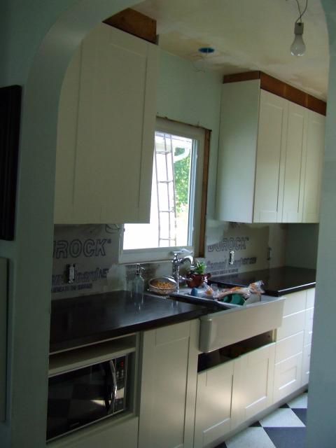
As of right this moment, this is my kitchen:
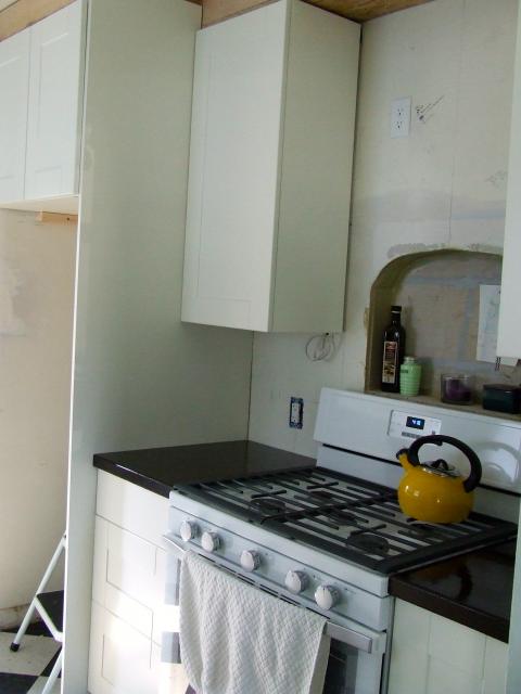
I know, right? Turn your head and look at the other side.
Sorry for the awkward angles. It's a galley, you guys. It's lovely, but it's still tight.
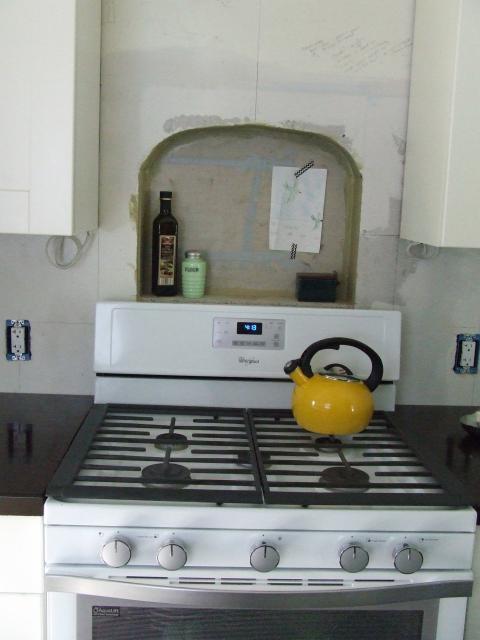
If you are an observant person, you might notice that we moved the range and somehow lost a fridge. More on the fridge later, but yes, we moved the stove. We needed the magical kitchen triangle to be closer than it originally was, and we were sick of having a window next to a stovetop. We are the royal family of open windows, and we were sick of our coveted afternoon breezes blowing out the gas burners. Plus the window at the end of the galley faces south, which means hours of fresh, hot sunlight pouring on whichever poor soul was destined to cook at the oven in the evenings. (That would be me.) So our contractor moved the gas line and put in all the necessary equipment for a range hood (WHICH WE'VE NEVER HAD, OMG, YOU MEAN I WON'T HAVE TO SWEAT OUT OF THE TOP OF MY HEAD IN ORDER TO PREPARE A MEAL NOR DEAL WITH THE ODOR OF A THOUSAND DINNERS SEALING THEMSELVES IN THE WALLS OF MY HOME, WHAT WITCHCRAFT IS THIS??!!) and then, AND THEN, I said, "Hey, can you do a wall niche?"
All casual-like, as if I ask for niches from talented professionals ALL THE DANG TIME.
I got me a wall niche.
I will probably say this about 649 other things before this blog post is done, but that wall cut-out might be my favorite thing in this room. It's certainly my favorite a-ha! moment that came from my very own brain pan. After we demoed but before our contractor arrived, I was just standing around, reminding myself that it would all be worth it (*sob*) and then I turned toward this blank wall and BAM Jesus hit me with this amazing idea: You are going to have to tear out the walls anyway, woman. Why not use that to your advantage and look like a kitchen from a magazine?
Thus the idea for Wall Niche was born.
Only after Jesus hit me with this amazing idea did I turn to Pinterest and find inspiration photos to show the contractor, who is a total genius and completely caught my vision AND THEN hit me with this other amazing Jesus-given thought: "Instead of making it a rectangle like most of these you see, why don't we round out the top and make it an arch that mimics the arched doorways in your home?"
I do not want to be flippant about our Christ, but man, He was working niche miracles that day. Along with our contractor, who took notes on how high and wide I was thinking, broke into that wall, worked around and built up the studs, and just did an amazing job with it. He gets a million points to Gryffindor for that built-in ALONE.
(I should note that all of the drywall on this side, including the niche, will be tiled. It's bare now, obviously. This is another time where you need to squint and imagine.)
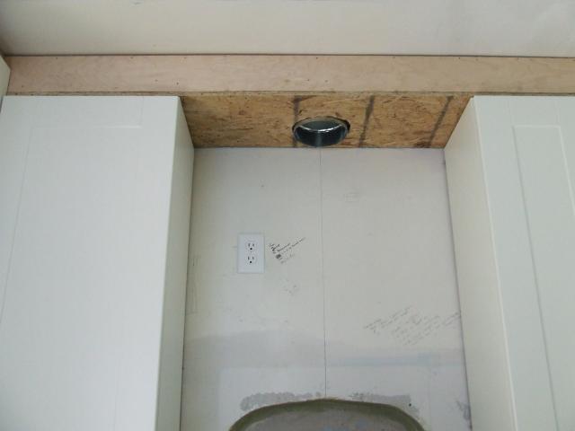
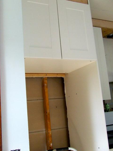
Just above the miracle niche, in between the two upper cabinets, is where we're all prepped for a built-in exhaust fan:
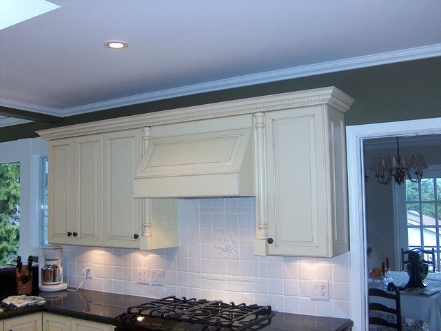
Instead of going with a naked stainless hood, we are going to use a model that requires a custom-built cover so that it looks like just another cabinet, painted white and all. I'm not really a stainless fan, and I like the idea of as little interference on this small wall of cabinets as possible. Here's a possibility:
I literally just googled that right now because I am too lazy to sign into Pinterest and find the actual 300 range hood posts I have saved, but you get the idea. We're holding off on the range hood and surround because we need to save up for that project. I don't know if I've mentioned this, but dang, remodeling a kitchen from scratch is expensive. Did you know that? Well, now you do.
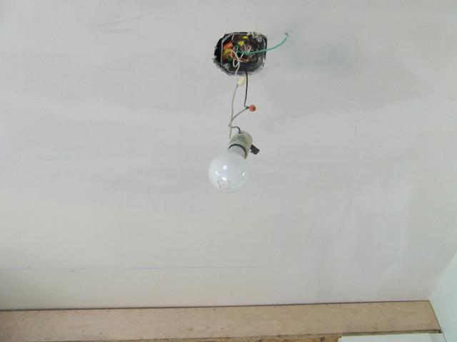
Just to keep it real, here's a picture of the actual light we are using in this room:
Believe it or not, it's still better than what we had before. By the time this is all done, we'll have two semi-flush mount schoolhouse fixtures on the ceiling, a pendant over the sink, under cabinet lighting all over the place, and lights built into the range hood. But I am planning a special thing for my ceiling that forces us to hold off on lights for now. I'm keeping quiet about that at the moment. For now, bare bulb dangling from the ceiling is our jam.
Something to note: You may have noticed the soffits the men built up on top of the wall cabinets. These serve a couple of purposes. The soffit above the wall we're looking at, the stove wall, conceals the duct work for the range hood ventilation. (It vents out the side of the house, to the left, which is the back side of our home.) The soffits also will serve as a place for trim and crown molding. I wanted my cabinets to go all the way to the ceiling for as built-in a look as possible. I really think that finishes a kitchen, and the idea of a few inches of space just gathering dust above my food prep areas fills me with ick. Ikea wall cabinets are supposed to be hung something like 5" from the ceiling (plus we have old plaster walls, so who knows how level everything is?), so the soffits fill in that gap and will eventually get covered for a faux built-in look. Make sense?
Moving on to the fridge. I decided to NOT plan our current fridge into this design because it is a) 15+ years old and b) too big for our space. It's a perfectly functional Whirlpool that works great, but I couldn't get cabinet configurations to work with its two-door, 34" self. It's just too big for the room. So we moved it to the basement and it is now officially called Basement Fridge and that's what we are using for now. Why, you ask? Well, because the 30" fridge that I want is expensive and I am also saving up for that. For now, we have a perfectly proportioned space just waiting for it.
If you look carefully in that enclosure, you can see the drywall patch from what used to be the only light switch in the room. Because walking all the way to the end of the room, sticking your hand in the dusty space in between the fridge and the wall, and groping for a light switch/outlet plate (why the outlet? no one ever knew) made SO MUCH MORE SENSE than just having switches in reasonable places. Now we can turn our bare dangling bulb on and off from two places in the room, just like rich people.
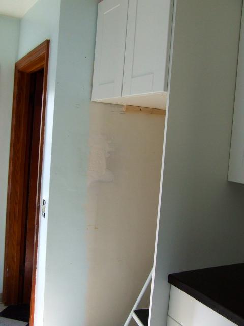
Here's another angle of the enclosure:
In case you're looking for specifics, that's a 24" X 24" X 30" over-the-fridge Akurum cabinet. It's built out just slightly so that it, combined with the panel on the right, will cover the refrigerator COMPLETELY and only show the barest amount of huge, looming appliance. I can't afford a cabinet depth refrigerator, either money- or width-wise, so I'm going to fake it as best as possible with a standard depth fridge. Our contractor was a genius who suggested we pull out the plaster in between the studs for appliance ventilation, thus giving us a few inches off the depth dimensions. We're just fine using Basement Fridge for the time being, but I know this will all look great when it's got a real, actual Main Level Fridge filling it out. (We'll still keep Basement Fridge! We love you, Basement Fridge.)
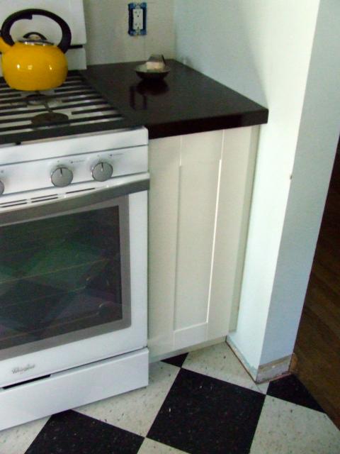
Jump to the right of the stove and you'll get a taste of how great Ikea's cabinet options are for space-crunched kitchens. Here we have what looks like an innocent, 15" lower cabinet door…
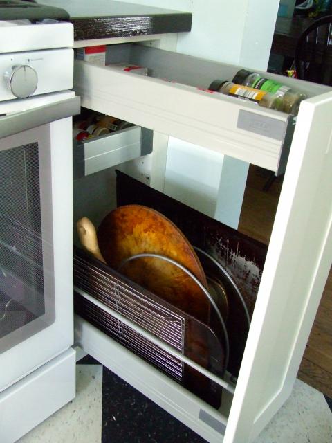
…but open it up and *gasp!* it actually turns out to be a 15" pull-out cabinet with two narrow drawers built into its top!
Kroger and Aldi spice containers represent!
I bought a thing from Ikea that helps hold up cookie sheets and what-not, and this is a PERFECT amount of space for me. For now I'm putting spices in the wee drawers. I know some people would fret about them being next to heat, and I'll take that into consideration, but for now I actually really like them here. They aren't toppling over one another in an upper cabinet, and since I'm a shortie with short legs, having them looming over me in an upper cabinet doesn't really make much sense anyway.
To the left of the stove on the bottom is a three-drawer unit that I completely forgot to photograph. Use your imagination.
Okay, let's shift our attention to the other side of the kitchen. On either side of the window on that wall are cabinets. On either side of the sink: cabinets. I squeezed as many cabinets as possible into this space, knowing it would be holding the bulk of my storage and counter space. This is another reason we moved the stove: Now I have over 8 feet of counter space just on this wall alone, as opposed to the 4 feet in the original design. If I had left the stove where it was, I would have lost out on all that glorious, nearly continuous countertop.
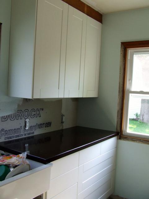
In this next photo you can see the cabinets to the right of the window/sink, as well as the butcher block countertop (I got it so dark, you guys!) and the window trim the men had to rip off (for now) to get the cabinets installed.
First, those countertops. Yes, they're butcher block; maple, in fact. We bought them in 8 foot sections and, as mentioned, my father-in-law expertly cut them in four pieces and routed the edges. Over the course of about three weeks, we stained them (Dark Walnut by Minwax) and then sealed them with Waterlox. I wanted dark to begin with, and boy, did I get dark. The maple just loved that stain. My only regret is that they are so dark that I lost most of the look of the wood grain, but I can deal. I like them, but yes, they are hard to keep looking perfectly clean. Don't get them this dark if you're not a fanatic like me who wipes down her counters approximately every 20 minutes. If you're looking for a more comprehensive tutorial, might I suggest looking here? Ours still need one final light sanding and oiling, but we installed them first so we could have better light than we did working on them in the garage. I can highly recommend the Waterlox, and I can also highly recommend my children's godparents, who had a bunch of Waterlox on hand and graciously let us use what they had left, thus saving us some money. Blessings on their heads.
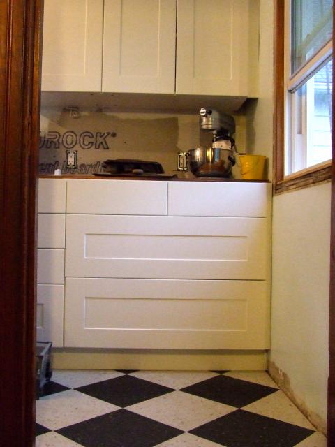
Moving on. I don't have knobs or handles yet, so it's hard to tell just what is what in the above photo, but that lower bank of cabinets houses some of the most glorious kitchen storage known to man. When I designed my kitchen, I designed it with nearly all drawers in the lower cabinets, knowing that I would be paying a lot more money than if I just settled for standard doors or even a mixture of doors and drawers. I love drawers, you guys. They use space wisely and are far easier to clean, plus with drawers you never find yourself sitting on the floor, half of your body inserted inside the cabinet, searching for a lost Pyrex lid. (FUN FACT: Been there, done that.) I figure, hey, how often do you get to design a kitchen from scratch? Pay the few hundred dollars extra and get the dang drawers.
So this same lower bank of cabinets looks like this when you walk up our back stairs from the basement or back door:
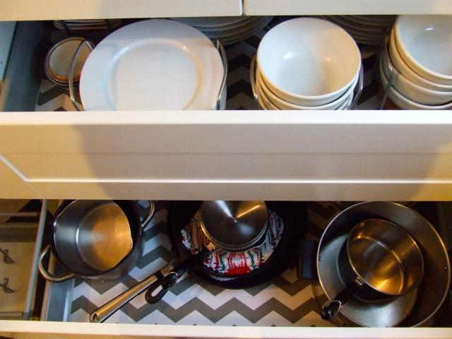
That's a 36" cabinet unit that has two deep drawers on bottom topped by two smaller ("standard" in Ikea-speak) 18" drawers. Those big drawers are glorious. Here's a semi-crappy shot of both of them in action:
The top holds ALL of my everyday dishes in pert little organizing caddies, and the bottom holds ALL of my pots, pans, and matching lids. Plus a griddle. I lined all of my cabinets and drawers with this liner and while it's indeed cute and affordable, like all shelf liner it represents a painstakingly slow job that will try your patience and make you lose your salvation approximately five times. You have been warned.
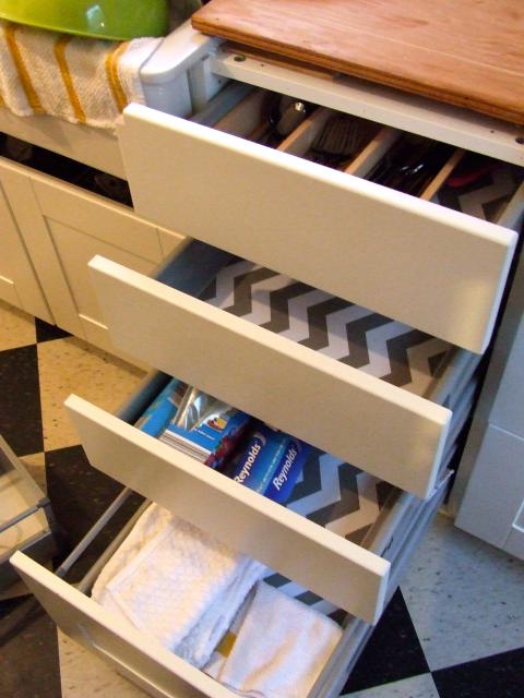
Directly next to the 36" drawer cabinet OF GLORY is an 18" four-drawer cabinet. The drawer on the bottom is a deep drawer and the other three are standards. As you can see, one of them is empty because I don't yet have anything with which to fill it. That's how awesome this kitchen is, you guys.
(That picture was taken while we were still finishing our countertops and were just using plywood.)
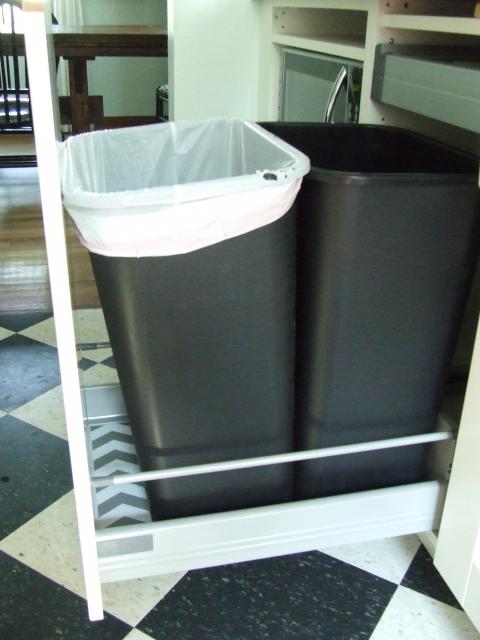
Next is the sink and its cabinet, which I'll feature some other time. It's the only basic lower cabinet I have, since the plumbing and some modifications we did to the sink didn't allow for the depth necessary in a drawer or pull-out. To the left of the sink is another feature that might be my favorite: an 18" pull-out cabinet that surprisingly effortlessly becomes a pull-out trash and recycling cabinet.
I realize this isn't perhaps as sexy-looking as a Rev-a-Shelf unit, but it works beautifully and really looks great in person. I had to measure very carefully for the containers, but these were some from Lowe's that fit well enough to allow one of those mini-drawers at the top of the cabinet. (You can see it closed in the above photo. It's our junk drawer.) I LOVELOVELOVE having my trash and recycling containers right here, and the side parts to the drawer unit hold them in just fine. One thing I was worried about was them not staying upright, since I know the Rev-a-Shelf design holds them up on their tops, but thankfully my fears ended up being unfounded. Ikea will recommend a 15" pull-out cabinet with their own plastic containers for trash, but their containers are puny. Splurging on the extra 3" was worth it for trash and recycling cans we could actually use.
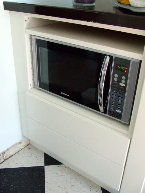
Next to the trash cabinet is a modification we cooked up after I saw a similar design on Ikea Fans. I wanted our smallish microwave off the cabinet and as out-of-sight as possible. We briefly toyed with buying a new microwave-as-vent-hood unit, but those are so dang huge and, let's face it, microwaves are not pretty. Why feature it on the smallest wall of my kitchen if I didn't have to? Thus the microwave cabinet was born. My mom did something very similar in her recent kitchen remodel, so I knew it was possible.
Here's the thing: There are gaps in that cabinet because the Ikea kitchen salesman talked me out of my original plan (a deep drawer on bottom and a standard drawer on top of that, then a shelf for the micro) because he thought it wouldn't fit the micro; he wanted me to buy two standard drawers. Imagine my irritation when we put it all together and I saw that, indeed, my original plan would have worked and was actually an awesome plan to begin with. For now we're living with it and will eventually replace the bottom standard drawer with the deep drawer, thus eliminating the unsightly gap.
Look at me, gushing about my trash cans. I must be an adult.
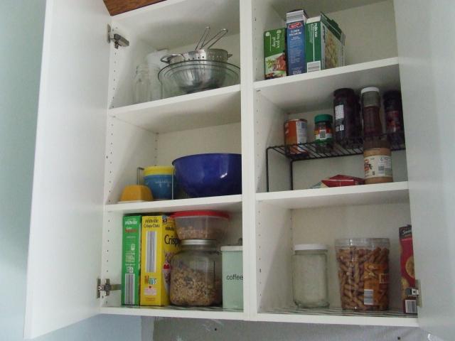
I'm almost done, I promise. I wanted to show you at least one of my upper cabinet units in action. This is the two-cabinet unit above the microwave, to the left of the sink, which we use for most-used pantry items (we have a pantry downstairs for the long-term stuff) and some mixing bowl storage.
It's not all stored in cute jars with chalkboard labels, and I am sure it will get stuffed full as time goes on, but I can guarantee that it will always be neat and tidy. With chevron shelf liner. Amen.
And…that's where we are! Right now, our kitchen is functional and pretty and getting there. We need trim and molding, tile, a couple appliances, lights, and a few other relatively minor touches, but the big, scary stuff is done. And guys, it feels so good. So very good.
NO. MORE. PLASTER DUST. Amen.
No comments:
Post a Comment