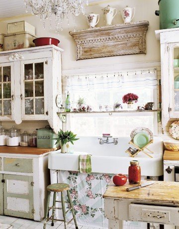
If you've been around the blog any amount of time (and have been paying attention), then you'll remember my feverishly excited post from nearly three years ago. I had found a picture and I was in love:
I had also found a huge antique cast iron sink, and thus my love for antique sinks was, if not realized (as I have a couple in the house already), fully bloomed. When we began planning and measuring our kitchen in earnest, we had to come to grips with the fact that our bargain antique sink was too large for the space.
I still love the look of a random, flea-market-find kitchen, but I also realized that it wasn't very practical for a kitchen like ours that is low on space and in desperate need of efficient cabinet design for maximum storage. What I retained from that original picture was a white cast iron sink, butcher block countertops, and pops of Jadeite and other mint-colored items. (I already slowly collect Jadeite pieces--score!)
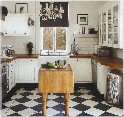
As far as flooring went, I knew I wanted a black-and-white tiled floor on a larger scale than our upstairs bathroom. (The majority of our downstairs flooring is hardwood, but we've tiled the downstairs bath and entryway with period black-and-white floor tiles, too, and so I like to keep the black-and-white theme going where there isn't hardwood. I didn't like the idea of doing hardwood in the kitchen since it sits at a right angle to the hardwood in the dining room and would be difficult to match to the original oak.) This picture is a good idea of what I was going for:
The tile is set on the diagonal and everything! There's a farm sink with a deep apron! White cabinets! Now we're getting somewhere.
It's hard to tell whether that particular floor is tile or linoleum or painted wood, but you get the idea. I initially had my heart set on true linoleum (Amstrong's line is called Marmoleum), which is eco-friendly and long-lasting and antimicrobial and just in general a magic material.
And note: It is NOT the same thing as vinyl. Vinyl = petroleum based. Linoleum = natural materials based, mainly linseed, thus the name. Linoleum pre-dated vinyl and was only eclipsed by vinyl because anything petroleum-based is cheaper. Large-scale places like hospitals and schools very often still use linoleum flooring because of the clean factor. Consider yourself educated. I wasn't when I began this process, but now I am, and I will never tire of lecturing people who don't really know what linoleum is. Those people include nearly all the local flooring store employees in town. It's insane.
Anyway, I had to finally admit that linoleum was out of my budget. It runs around the same price as marble, plus underlayment, and I couldn't justify $700+ for a 92 square foot kitchen. So then I discovered VCT, also made by Armstrong, which is vinyl (sorry, environment) that mimics linoleum and runs $.69 a square foot. Boom. Suddenly my flooring was both awesome AND affordable. Imagine.
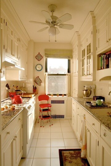
Here is a picture of a white galley kitchen that gave me hope. It's not exactly the look I'm going for, but it's pretty hard to find pictures of galley kitchens because apparently everyone else in the world (ha) owns a large open kitchen with professional appliances (ha) and islands. No one lives in old homes? Really? Everyone can expand or knock down walls? (We couldn't really do that even if we wanted to. Our kitchen sits squarely in between our property line and a staircase.) Hmm. So it's just me with a bowling alley for a kitchen? Okay, then.
I tell you, it gave me hope.
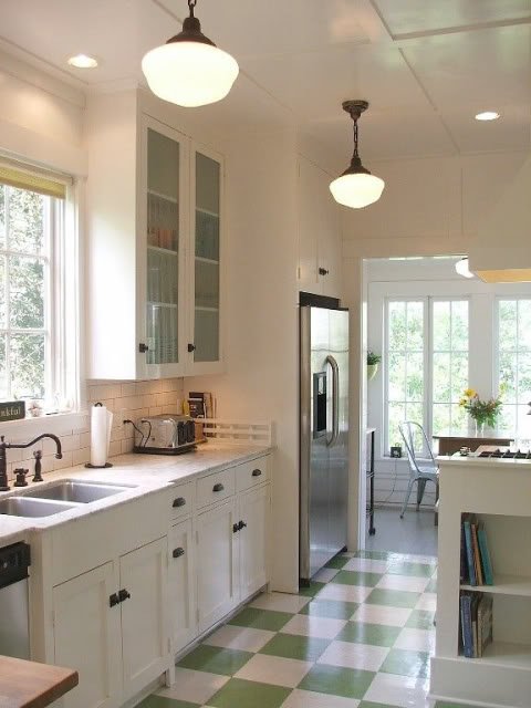
This next picture is from a neat home you can rent in Galveston. I loved the floor, the white to-the-ceiling cabinets, the schoolhouse fixtures, and the white subway tile with dark gray grout. It's simultaneously on-trend and traditional, and I can't afford to have a kitchen that is going to be outdated in 5 years. This kitchen just works.
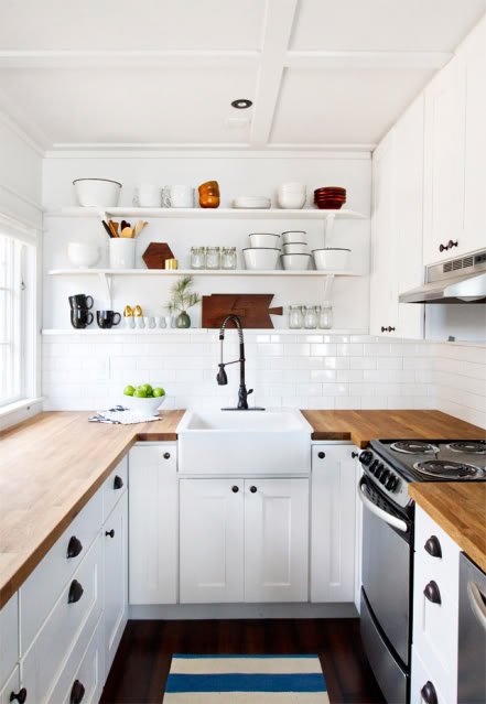
This next kitchen is really popular in Internet-land, for good reason. This gal has taken a small space and made it lovely and functional and beautiful, while taking popular elements, like open shelving and an ORB faucet, and married it with traditional white cabinetry, the white sink, white subway tile, butcher block, and real-life appliances in a real-life space. She's a genius. And her cabinets are an almost identical look to our chosen cabinets, which makes me feel like a genius by proxy.
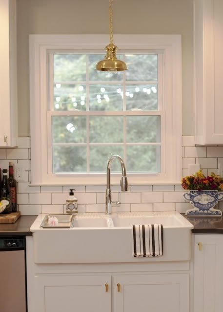
The sink in that photo is Ikea's Domsjo single-bowl sink, which, if you share my love affair with farm sinks and have done any measure of research, you will recognize is the most affordable option on the market while also being well-made and beautiful. We are opting out of a dishwasher in our kitchen (don't want it, don't need it, can't really justify the space it would take), so I decided to go with the larger double-bowl Domsjo, for maximum dish-washing potential, which you can see in action in this photo:
The sink! The cabinetry! The countertop! The tile! This homeowner might be my soulmate.
So those are my inspiration photos. I had all that inspiration firmly lodged in my brain last fall when I took part in a contest the housing design department at my alma mater does every year. Each year the senior design students do an Ugly Kitchen Contest, and the head of the department puts out a call for staff and faculty with truly ugly kitchens who would like free design done by senior design students. It's a win-win for everyone! We signed up this year, and I got hooked up with a truly awesome student who took my vision and ran with it.
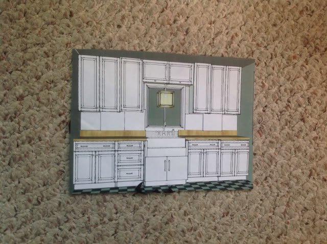
Here is a (fuzzy) picture of her design. Sink side of the kitchen on the left, appliance side of the kitchen on the right:
I have too many kids calling for my attention while I blog to make that picture any better.
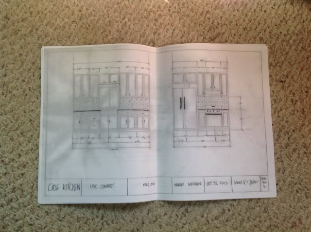
And here's a more complete draw-up she did for her final presentation of my space:
Out of all the other design students, her design won the contest! The department chair said that the judging committee liked the design for its simplicity and timelessness. Boom.
Now, my final design doesn't include everything she suggested here. I'm not even using the same cabinets she was using for her dimensions. But her drawings give you a decent idea of what we were wanting to do. One big difference between the original kitchen and the new plan was that we wanted to move the range to the same side of the kitchen as the fridge. This opened up the sink side for nearly eight feet of counter space, where I had originally had maybe three. Whoa.
With a firm design in place, I was able to move forward, confident that my ideas were sound. I waded into the world that is Ikea kitchen design (oh my word, it's a crazy world), agonized over configurations and measurements for months, pulled the trigger in late March, and the rest is history. As I type this right now, my husband and father-in-law are getting the upper cabinets hung, which makes me insanely excited.
Thanks for letting me ramble so much about KITCHEN DESIGN. It's something near and dear to my heart, and I think that even after I have my dream kitchen, I'm still going to be excited by kitchens.
Next time I post, I'll take a break from kitchens and just do a funny kid story or something. Promise.
2 comments:
Ok, so I love all the inspiration and everything, and I can't wait to see the new kitchen (since, ya know, we had the honor of helping to destroy the old one). But the main comment I want to leave here is this: does that first black and white kitchen have a trap door?!?!?!?! If so, pleeeeease tell me you are installing one in yours!
Love the farmhouse sink and white cabinets. Thank you for standing up for "ordinary" white appliances. Stainless looks sleek but I just have a mental picture of some future DIY channel homeowner tossing them into a dumpster, sneering that they're SO early-2000s. And the formerly-humble workhorse linoleum is as pricey as marble now?! Can't wait to see the finished project!
Post a Comment